Medical appointment scheduler
As the UX of this project as part of an Agile team. I worked with developers, PO, scrum master as well as the stakeholders of both Tua Saude and Rede D'Or in order to come up with a solution for their low appointment conversion.
Rede D'Or, the largest healthcare chain in Brazil, strategically acquired a prominent health blog called TuaSaude.com. Boasting an impressive readership, the blog garnered over 60 million monthly users, with approximately 2.8 million daily users and 29 million unique visitors each month.
The primary aim of this strategic partnership was to seamlessly convert the engaged reader base into patients, encouraging them to book medical appointments.
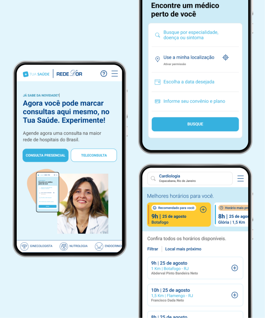
As depicted in the image next to this text, there was already an established scheduling platform in place—one familiar to their regular patients. This platform effectively converts with their user base and has undergone iterations over the years to cater to their needs.
Before assembling a dedicated team and prior to my involvement, two experiments were conducted by the stakeholders.
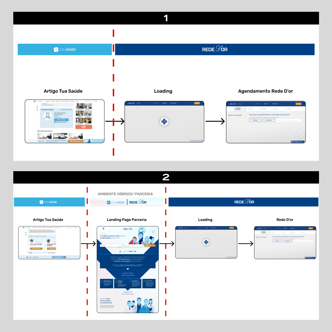
Experiment 1: Initially, banners were strategically placed on top articles of the blog. They were intended to direct blog readers to an external page, leading users into the already existing scheduling flow. However, the conversion rate was low.
Experiment 2: Recognizing that TuaSaude.com's readers were unfamiliar with Rede D'Or as a brand, the team implemented landing pages to provide additional context. The same banners from Experiment 1 were strategically placed on top articles, guiding users to these landing pages. The content on these pages combined informative details about the partnership with a clear call-to-action for scheduling, subsequently leading users to the scheduling flow. Despite these efforts, the numbers continued to underperform.
After these two experiments, the client faced a straightforward challenge: conversion rates remained stagnant at 0.01%.
Stakeholders decided to halt efforts to drive readers to the existing scheduling platform. Instead, they chose to centralize all scheduling within Tua Saúde's environment, utilizing the scheduling API. This shift presented a unique opportunity: to develop a product from the ground up.
This marked the initiation of a collaborative effort as a dedicated squad was formed, and my involvement in the project began.
During this phase, we thoroughly explored Rede D'Or's existing booking experience, analyzing its current flow and the iterations made over the years. We didn't limit our research to direct competitors but also examined various other booking platforms outside of the medical field to gather insights.
With insights from the discovery phase, our team prioritized functionalities for the MVP launch, assessing what was technically viable within a short timeframe. We employed the MoSCoW technique to define these priorities.
Operating under a tight two-week deadline and with no time for usability tests, I focused on defining a new flow and UI that aligned with both brands. While utilizing Rede D'Or's Design System and existing components from their booking platform, I also created unique components for this new product.
As developers translated my Figma files into code, I conducted multiple Quality Assurance (QA) rounds to ensure the interface and experience matched the design, addressing any bugs. Continuous iterations were made based on insights from watching users on Hotjar videos, studying analytics, and business decisions made along the way.
Just before the product launch, I initiated user research, incorporating both qualitative and quantitative methods.
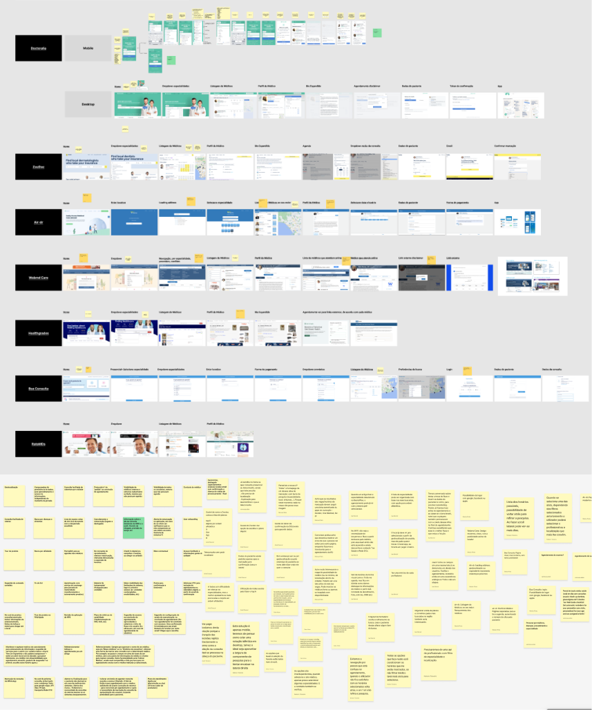
In the initial phase, I initiated a comprehensive mapping exercise within a Figma Jam file, covering a diverse array of booking platforms. It started with doctor appointment references, including those from direct competitors in Brazil as well as other medical platforms globally. During the process, I expanded beyond the exclusive realm of doctor appointment scheduling, broading my benchmarking to scheduling flows and conversion funnels from other industries, such as flights, hotels, and car rentals platforms.
With this extensive study in hand, I invited all stakeholders and team members to contribute their insights through comments on virtual post-its. Their input highlighted both positive and negative aspects concerning user experience, layout, tone of voice, and flow.
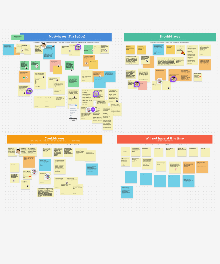
In the Define phase, I distilled insights from the previous session and consolidated potential features and functionalities onto a board. This board consisted of a myriad of scattered notes that required sorting, filtering, and subsequent clustering. To streamline prioritization, we chose the MoSCoW technique.
During a subsequent team session, we collectively identified priorities. We distinguished the 'must-haves' as immediate additions for the MVP, while the 'should-haves' could be considered for the next release. 'Could-haves' were potential nice-to-haves for a more distant future, if ever prioritized. And 'will not have' encompassed items discarded indefinitely.
The tangible outcome of this phase was a list of 23 features and functionalities that had been unanimously agreed upon among ourselves and endorsed by the development team as technically feasible.
To build a product from scratch was both exicting and intimidating. As a team, we recognized that would afford us significant freedom from the constraints of the existing scheduling platform—across flow, functionalities, and overall look & feel. However, this opportunity brought its own set of challenges: I, as the solo UX designer, had only 2 weeks to design the entire mobile interface, and the development team had to create a fully functional product within a two-month timeframe.
Our understanding of this user was limited, and time constraints ruled out user research. The majority of decisions, as you will see below, were informed by Google Analytics data, insights derived from reader feedback in the blog and comments on social media, and our observations from watching Hotjar videos.
Below, I elaborate and provide a detailed breakdown of this phase of the project.
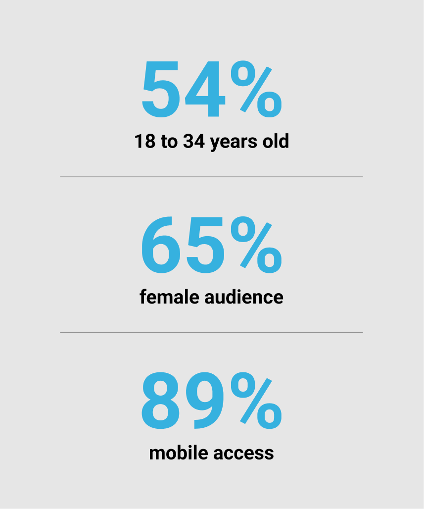
Data from Google Analytics provided us with clarity about this user: young, predominantly female, and accessing the blog via mobile.
Despite the blog being headquartered in Portugal, out of the 60 million monthly users, 90% were from Brazil, with the majority concentrated in three key cities where Rede D'Or has hospitals: 26% from São Paulo, 10% from Minas Gerais, and 9% from Rio de Janeiro.
The age distribution showed that 54% were between 18 to 34 years old, and the audience was predominantly female at 65%. Mobile access was at 89%, with 72% using Android phones.
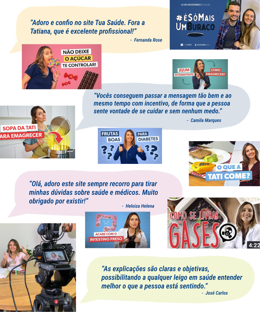
With new visitors arriving daily through SEO strategies, word-of-mouth recommendations, or social media, Tua Saúde has successfully garnered a loyal readership. They receive an enormous amount of feedback from readers via email and comments on social media, allowing us to gather some of the messages and notice a common thread.
The underlying value of trust built between the audience and the founder, Tatiana, stood out prominently. As a spokesperson, Tatiana has become a trusted advocate for medical information, but most importantly, for living a tangible and healthy life. Readers love how the founder is approachable, speaking candidly and with a blend of warmth about anything and everything, from everyday topics to more serious health matters. These loyal readers not only recognize the brand but also trust its content, finding solace and support during moments of pain, curiosity, or uncertainty.
We then ran with the assumption that this readership has formed a unique connection, and our new medical appointment platform could leverage that by displaying her image and name front and center as an endorsement for this new partnership and new product.

We did not have enough data to construct a detailed persona due to the time constraints that prevented us from conducting user research, as mentioned earlier. However, we gathered enough information to create the Ideal Customer Profile (ICP), outlining the most likely user to convert. The ICP profile we came up with includes women aged 18 to 34, with health insurance, residing in São Paulo, Rio de Janeiro, or Minas Gerais, owning Samsung devices, and following TuaSaude.com due to a connection with - and trust in - the founder, Tatiana.
This knowledge served as a guiding star for the MVP. Based on this, we made decisions regarding the interface, tone of voice, components, and the overall flow.
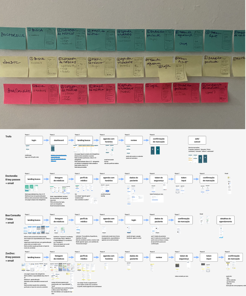
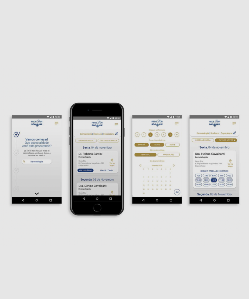
I thoroughly analyzed the workflows of four competitors — Trofa, Doctoralia, Boa Consulta, and ZocDoc — to extract insights into successful practices, identify areas for innovation, and pinpoint instances where reinventing the wheel might be unnecessary.
During this exercise, we realized the need to incorporate a token mini-flow to avoid potential spam, given the API constraints preventing user login.
A crucial consideration for this product was that users lacked familiarity with Rede D'Or doctor names. If a user landed on our product with a specific concern or pain, we assumed they would seek the earliest available slot rather than waiting for any particular doctor. To address this, instead of listing search results based on doctor names, which were likely irrelevant to users, we prioritized offers based on the soonest available slots.
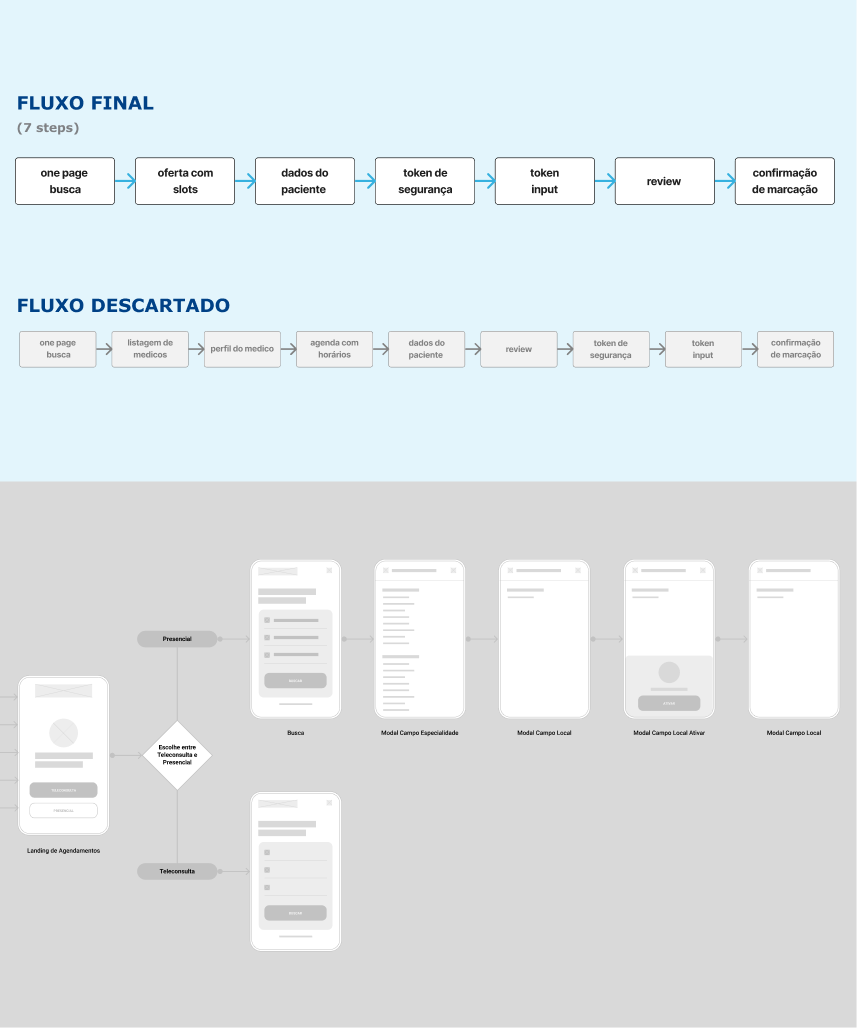
Moreover, I emphasized keeping the flow as concise as possible. The flow itself underwent a couple of iterations, including the introduction of a divergence between in-person appointments and telemedicine, ultimately leading to a flow deliberately departing from Rede D'Or's established scheduling platform.
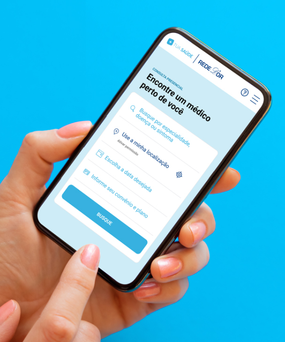
The wireframes were created considering an Android screen size of 360 x 640 px, recommended by Google Analytics as the primary device used by the majority of users.
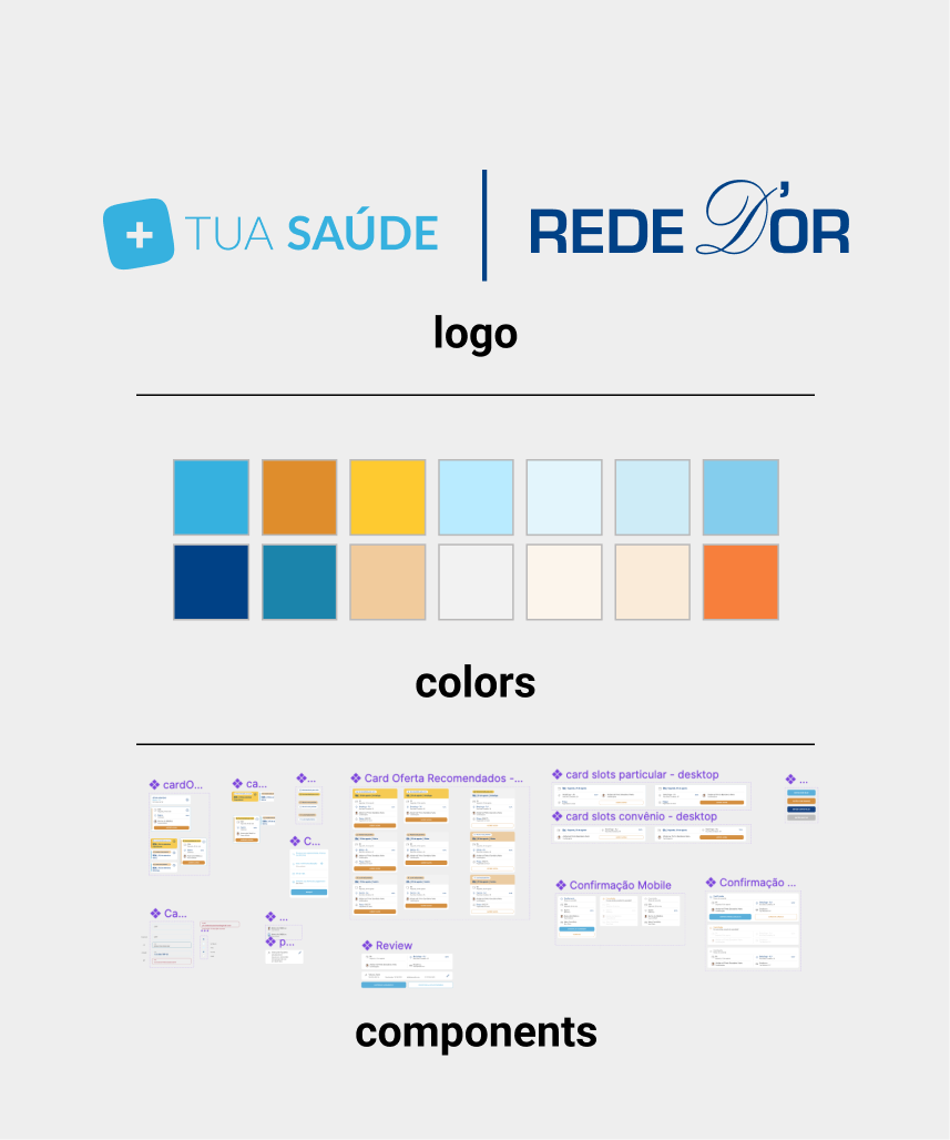
To convert readers into patients, it wasn't just about creating a Minimum Viable Product (MVP) but rather a Minimum Lovable Product. We understood that authenticity in tone of voice, look, and feel was crucial. Targeting Millennials and Gen Z, I integrated microinteractions and animations to add a personal touch, as if directly from Tatiana herself. Collaborating closely with the UX writer, we crafted text and call-to-actions mirroring Tatiana's warm, casual, and approachable tone. While leveraging Rede D'Or's Design System and existing components, I also developed unique components for this new product. Some of the UI elements were later adapted to React components.
Merging two established brands with stablished guidelines was a challenge. My aim was to find a balance, blending Rede D'Or's dark blue and orange with TuaSaude.com's brighter blue, enhanced by additional warmer and more youthful tones.
Below, I'll outline some of the standout features from the MVP.
I researched offer cards and search features on successful platforms like SkyScanner, Kayak, Booking, and Priceline. We incorporated suggestions features inherent in travel platforms, bringing them into a medical context.
Our three top slots had the algorithm operating as follows: one offer showcased the soonest slot, another indicating the shortest distance to the user's location, and the top suggestion labeled "Recommended for you" representing the optimal blend of the first two suggested offers.
TuaSaude.com received numerous daily inquiries about health concerns, often from readers unsure about which type of doctor to consult for specific symptoms. Over the years, they compiled an extensive database covering body parts, diseases, and symptoms. By integrating this valuable resource with Rede D'Or's list of doctor specialties, we created a robust search feature. Powered by Algolia on the backend, the search field allows users to input virtually any query. After the third character, Algolia pulls suggestions for relevant medical specialties, helping users find the right doctor more efficiently.
The modal for users to input the type of doctor's specialty defaults to suggesting the top 5 specialties, followed by an alphabetical list of all available specialties.
A "My consultations" flow was implemented, allowing users to access both upcoming and past appointments by entering their CPF number (the equivalent of a social security number). Additionally, users were provided with the option to cancel appointments - replacing the previous phone-only cancellation process.
Targeting Millennials and Gen Z, I integrated microinteractions and animations to impart a sense of "personal" touches, as though they were directly from Tatiana herself.
You can view a video showcasing the prototype by clicking here (the link opens in new tab).
Following the handoff of the mobile version, I also created the complete desktop version to match. Since the initial launch, numerous iterations have been made, including the addition of several fallback screens for unanticipated scenarios. We introduced the option to pay out of pocket, and for strategic reasons, telemedicine bookings were phased out.
The founder personally recorded a video to present the product. This demo was placed in the landing page.
With the phasing out of telemedicine, the need for bifurcation between in-person and telemedicine CTAs was eliminated, allowing us to integrate the search field directly into the landing page. This marked the first iteration in both the visual and the flow of the platform.
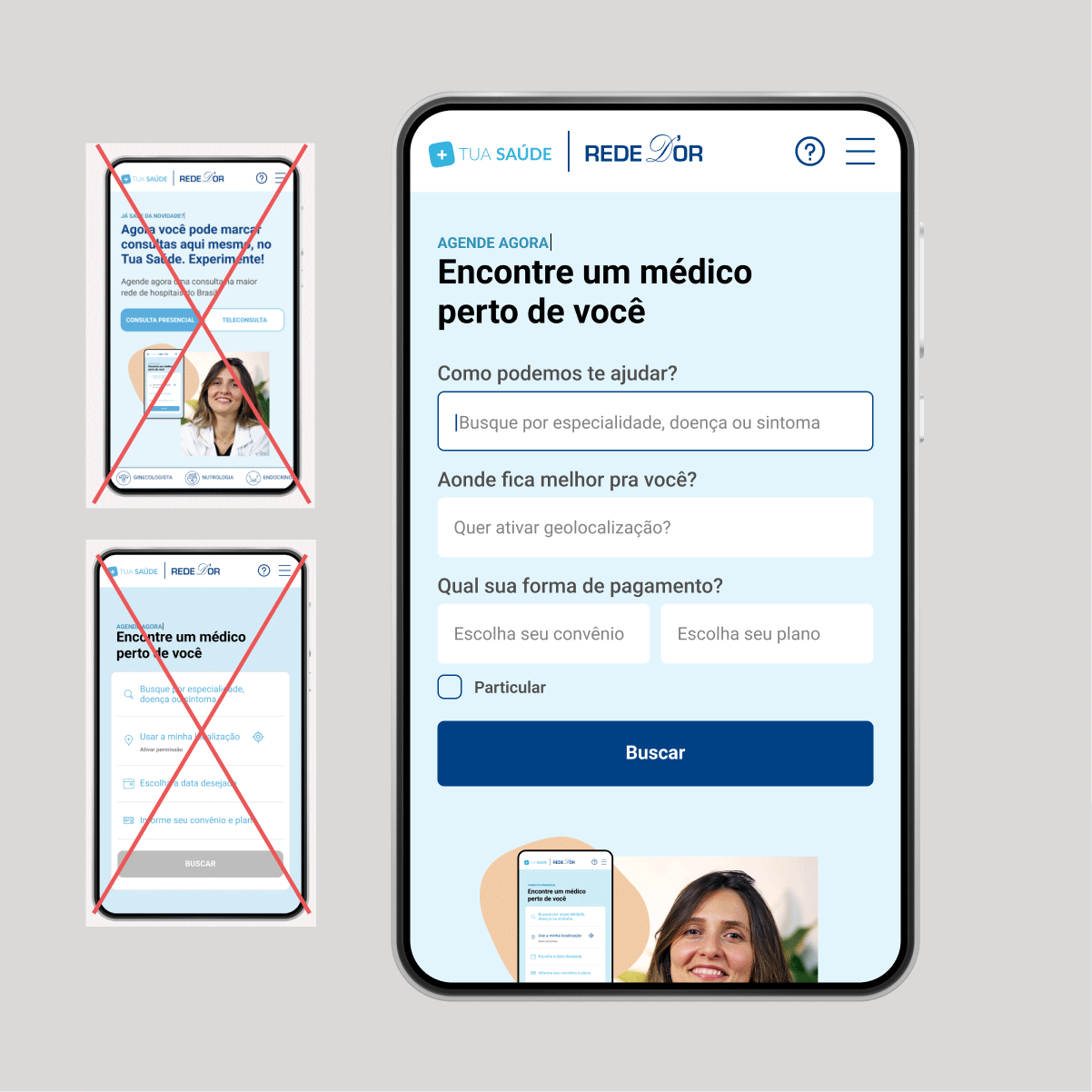
Following the launch and monitoring of user interactions through analytics and Hotjar videos, we observed high dropout rates on the initial screen. Many users would become inactive and not proceed further.
To address this, I redesigned the search component, incorporating autofocus into the first field and offering clear titles for each field as cues, along with placeholders. Additionally, I eliminated the date field, setting the search to default to the soonest available slots, simplifying the user experience. We also tested a nudge notification triggered after 60 seconds of inactivity to prompt user interaction.
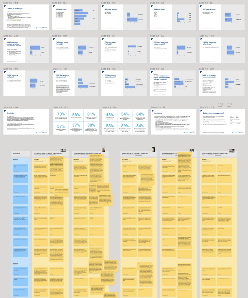
Banners were strategically placed in top blog articles, encouraging readers to participate in a survey. Collaborating with the UX researcher, we crafted survey questions aimed at gathering insights from our audience on various aspects including demographics, their relationship with the brand, lifestyle, health-related concerns, and their overall relationship with doctors and medicine.
Each participant received a thank you email with an exclusive video recorded by Tatiana, and also inviting them for a chat for a qualitatitve phase. Upon reaching our sample audience, we meticulously compiled the conclusive data from the quantitative research into a presentation for the stakeholders.
Following this, we reached out to participants to invite them for a chat, and we conducted interviews with 5 users. Based on their responses, we reached a deeper unsderstanding of the user cross between both platforms.