The Rebirth of a Maternity Portal
I was entrusted with redesigning Rede D'Or's maternity portal, adopting an end-to-end approach that considered user needs, business objectives, brand strategy, visual design and UX best practices. This comprehensive redesign spanned several months. Below, I'll guide you through the journey from the initial brief to the final product launch.
Rede D'Or, the largest integrated health care network in Brazil, operates a network of 16 maternity facilities across the country with 47 thousand childbirths per year.
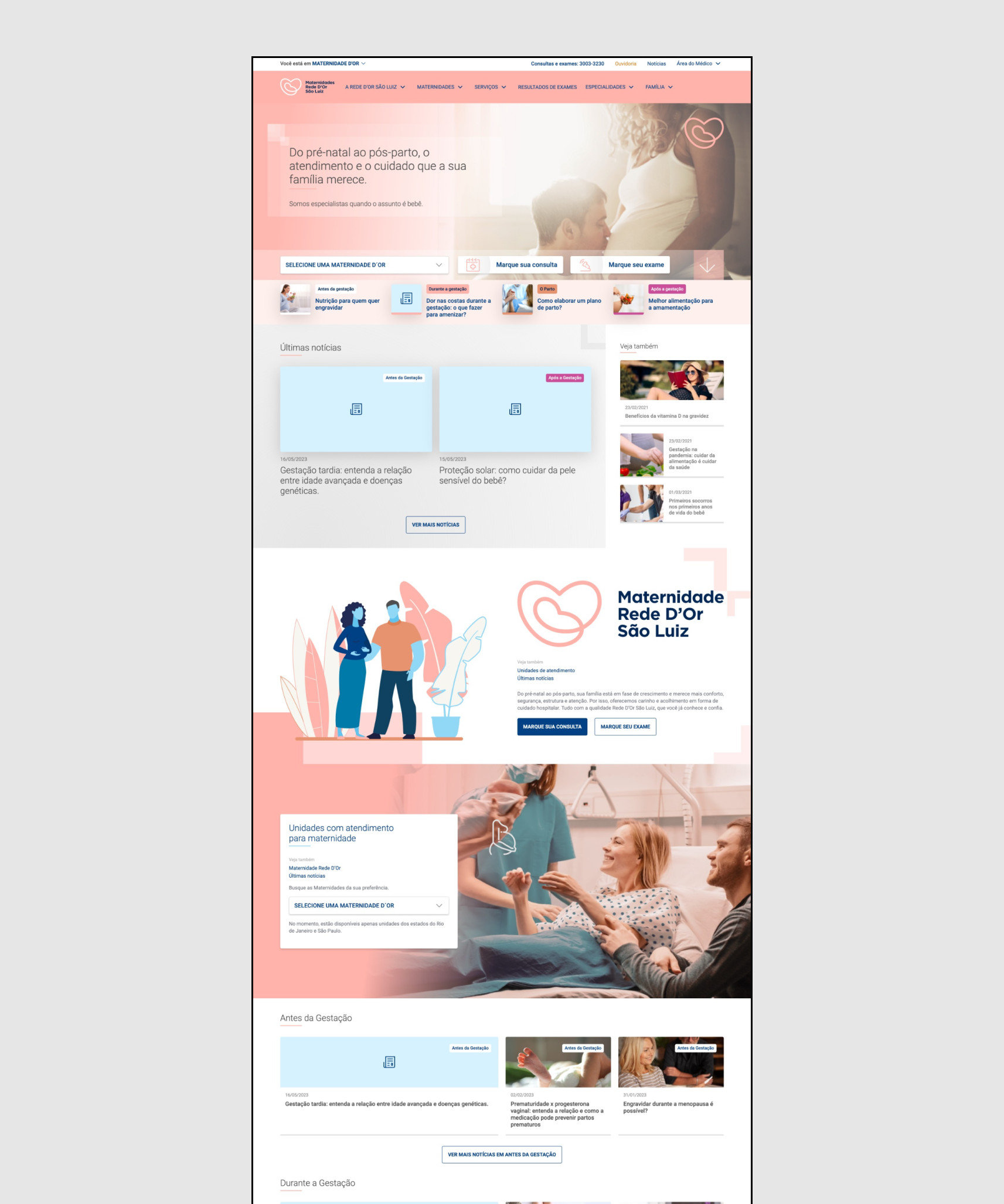
At the outset of this project, their existing maternity portal exclusively served 6 maternity wards of São Paulo. While the remaining maternity centers outside São Paulo each maintained their own separate websites. With that, the business team decided it was time to create a centralized platform to unify all maternity facilities under the Rede D'Or brand.
This new portal aimed to function as a central hub offering a wide array of services and serving as an invaluable source of information for women, covering everything from pre-pregnancy to the early years of parenthood. In response to this directive, I was entrusted with leading the redesign of this portal, ensuring it effectively represented and catered to the diverse needs of Rede D'Or's maternity facilities across Brazil.
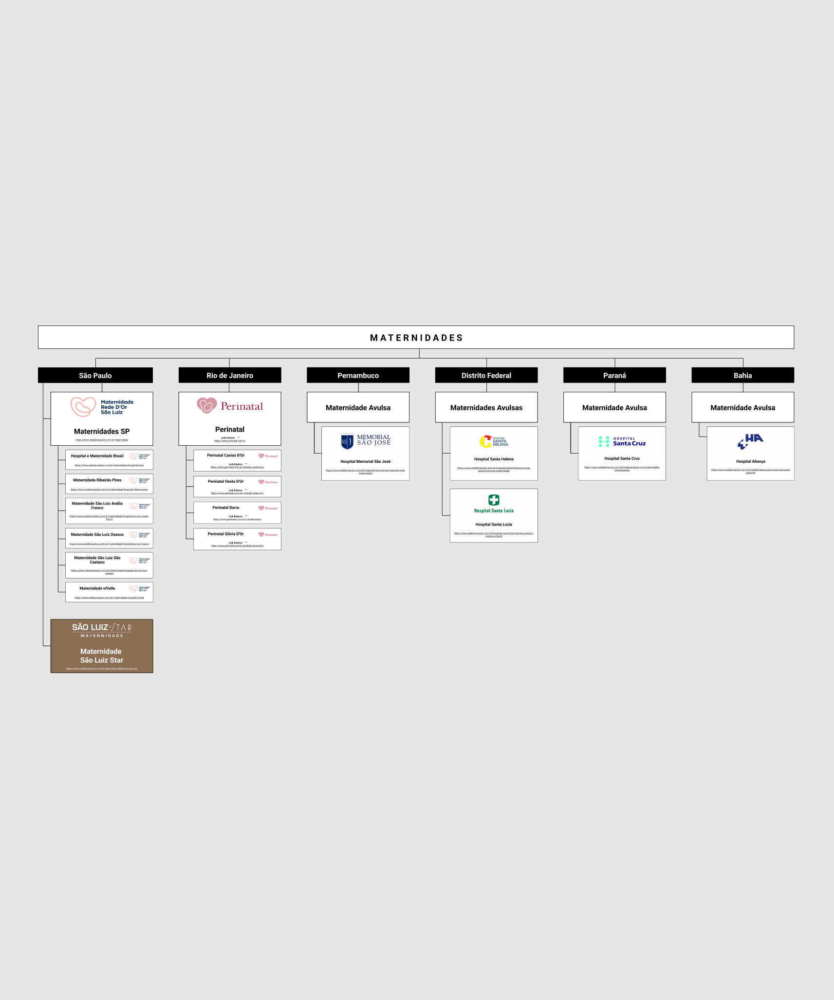
For starters, I created a chart to provide an overview of all maternity centers and their respective locations, as illustrated in the accompanying image. With this clear overview, I understood how some centers were affiliated with the Rede D'Or brand, some operated under their own brand as chains with multiple locations, while others were stand-alone centers (maternidades avulsas).
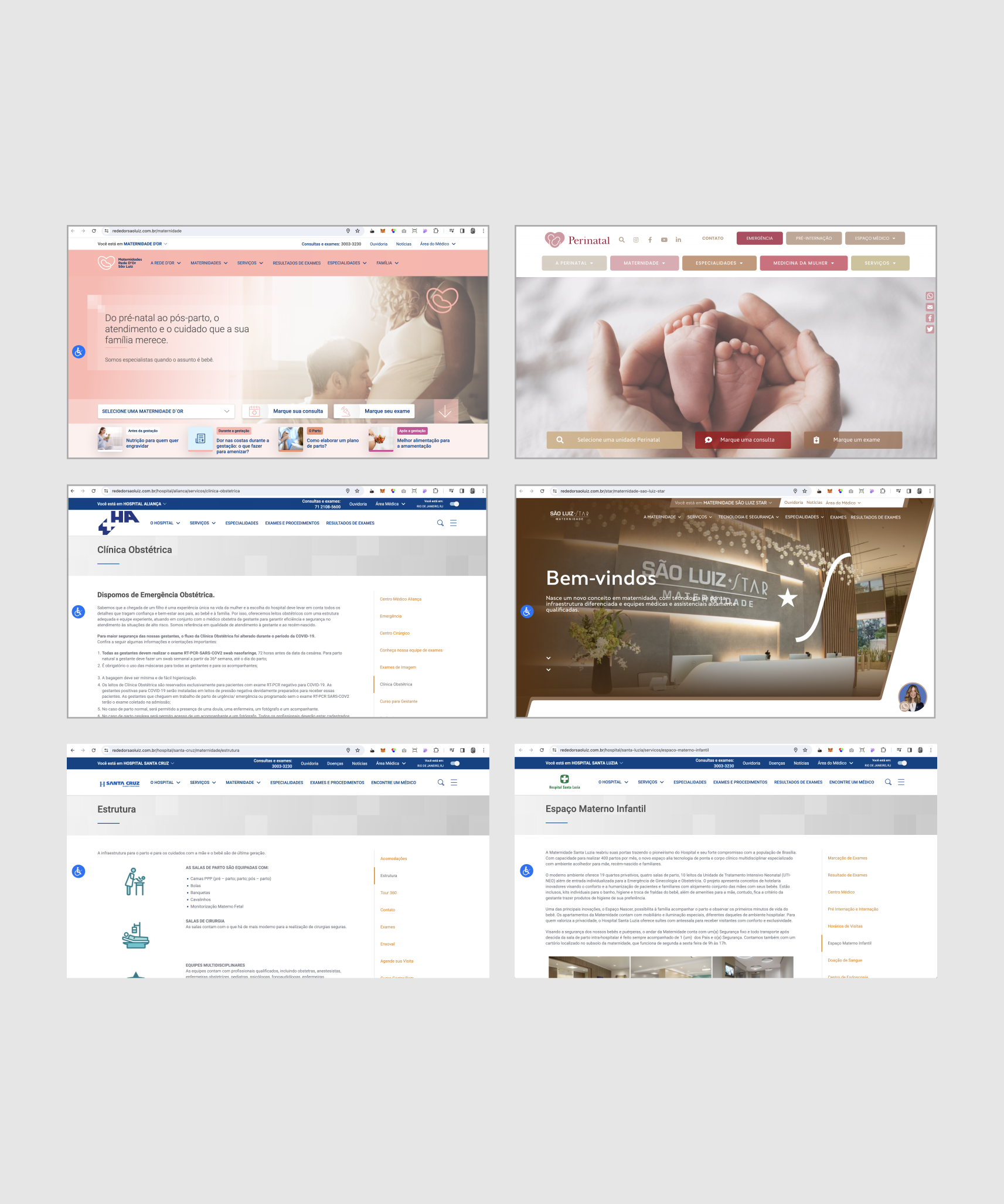
One of my initial steps was to conduct an audit of the number of websites for each Rede D'Or maternity facility. This revealed numerous inconsistencies. Each maternity center had its own approach to presenting amenities, describing services, and providing information on checklists, courses, and programs. Some offered content broken into subpages, while others had all the content in one long page with continuous text without any breaks, such as images, graphics, or bullet points.
Some of those facilities are devoted exclusively to maternity, such as stand-alone hospitals that solely offer services to mothers and babies, so their websites are incredibly more detailed. Some had videos, while others offered photos with virtual tours. In contrast, for others, the maternity ward is just a slice within a huge hospital, so these websites only mentioned their maternity services in passing, with just a tab dedicated to its content.
Additionally, I observed inconsistencies in the organization of sublinks and the grouping of content, as well as inconsistencies in the hierarchy of information. For example, "Newborn Tests" in one unit is listed under "Specialties," while in another, it is listed under "Services." Recognizing the importance of consistency and having one single universal organization, I prioritized ensuring uniformity across all centers, as this directly impacted the information architecture and taxonomy of new pages.
The team had given me carte blanche to redesign the existing portal entirely. While assessing the portal, I looked into aspects such as navigation, UI, layout, CTAs, flows and content. Some key observations that stood out were:
Representation: The site predominantly features white babies and families, which doesn't accurately reflect Brazil's mixed ethnicity.
Credibility of Content: While articles are authored and vetted by doctors, the blog lacks transparency about this, hindering trust-building with new users.
Content Gaps: There's a notable absence of content addressing worst-case scenarios or providing support for users facing challenging situations.
Brand and Website Aesthetics: The pastel colors give the website a childlike feel, which may not appeal to all users. Some elements, like the gradient overlaying photos, feel outdated.
Phases of gestation: The blog's five categories, encompassing "pre-gestation," "during gestation," "the birth," "after gestation," and "no category," didn't sufficiently capture the intricacy and complexity of each trimester, including the postpartum period (also known as fourth trimester), which could be considered its own category.
I conducted extensive research on a wide range of maternity portals, both domestic and international, along with pregnancy apps. During this process, I wanted to understand how these platforms structured their offerings and catered to the maternity journey.
I analysed their sitemaps and how they delineated the maternity journey into a coherent timeline. I also documented everything related to their interface, and listed the subproducts they offered, including tools such as trackers, checklists, and calculators.
In addition to gathering data, I collected screenshots of key pages such as the homepage, blog home, blog category, and blog article to gain an understanding of their user experience and user interface.
With valuable insights gleaned from this research, I identified numerous opportunities to enhance the Rede D'Or portal.
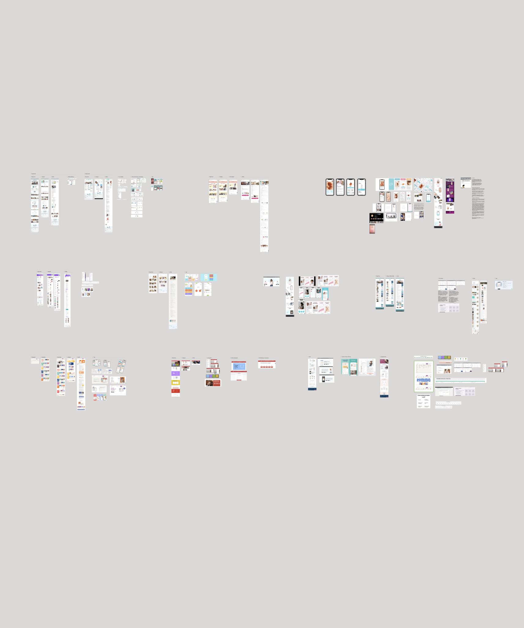
My goal was to ensure the project transcended superficial website changes, learning deeply the realities faced by our users. So I shifted my perspective: what initially revolved around business objectives needed reframing to center on the user. I delved into Rede D'Or's extensive user research, which, while extremely valuable, revealed a gap. Much of the material focused on ideal scenarios of pregnancy and childbirth—typically involving couples in prime fertility age with healthy pregnancies and no complications.
But it was imperative not to overlook the complexities of real-life experiences, given their role as a hospital. Turning to mom portals, blogs, and statistical data, a clear picture emerged: motherhood can be far from perfect.
Some women do not want kids ever, while others may unexpectedly find themselves pregnant. Some are actively trying to conceive, while others are hoping for their rainbow baby. The reality includes fertility struggles, miscarriages, stillbirths, or postpartum depression. Some may be affected by high levels of fertility hormones, face pressure from partners, worry about finances, or endure excruciating physical pain. Even in the best case scenario, this user might be experiencing gas, heartburn, morning sickness or the phenomena pregnancy brain.
Understanding this reality influenced our positioning, messaging, tone of voice, choice of photos, and more. Recognizing this reinforced the importance of acknowledging and addressing the diverse experiences, pain levels, and emotions of wanna-be, expectant, and new mothers so that solutions could be tailored to meet their real needs.
Rede D'Or's research had already established a persona based on their findings, laying the groundwork for my design choices. Building on this, I also took into account a few additional aspects about our users:
. Users may experience a wide spectrum of emotions, from joy and love to encountering heart-wrenching news, fear, or pain.
. Users engage with the portal at various stages of their maternity journey—from planning to expectant mothers navigating different trimesters, to new moms adjusting to life with a newborn.
. Users come from diverse backgrounds and income brackets. The recent introduction of the Installment Payment (Plano Maternidade) by Rede D'Or expanded access to a broader range of users. Previously, mostly users with health insurance or out-of-pocket funds could afford treatment and delivery at their hospitals.
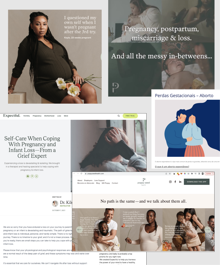
The initial research not only enriched our understanding of maternity but also uncovered valuable business opportunities for Rede D'Or. To help the team analyze the maternity journey through an empathetic lens, I documented my findings across the entire timeline of our users' experiences, spanning from trying to conceive to the child's first steps. Within this comprehensive outline, I also mapped key conversion points along the maternity journey, identifying areas where our products and services could offer significant value to users.
By focusing on the most complex scenarios, I pinpointed potential points of high conversion, presenting lucrative opportunities for the company. From our appointment and exams scheduling tools to the pharmacy marketplace and surgical procedures, I outlined a cross-channel strategy that aligned with both user needs and business objectives.
It became clear that the redesign needed to address not only the flow and experience but also the visuals and even the content strategy. Everything had to align seamlessly. To gain stakeholder approval, I prepared a presentation detailing my research process, findings, and the proposed redesign's impact. The comprehensive redesign proposal included:
Until then, all content was differentiated by unit. For the resign, I proposed defining and aligning the organization/grouping among all units to avoid discrepancies. Content will be organized into groups based on user needs and impact, with an emphasis on conversion opportunities throughout the user journey. Simplifying the menu hierarchy and adding a search functionality to make navigation easier for users.
In light of my findings during research, I proposed a paradigm shift – to change the narrative around motherhood and to debunk the idealized depictions of pregnancy and childbirth. By opening up the conversation and acknowledging the diversity of experiences, we aimed to create a supportive space for all mothers, ultimately making their journey smoother and more empowering.
The brand and website utilize pale, soft, pastel colors, giving off a childish impression that may not resonate well with the persona-an adult, mature woman. Additionally, the overly cute and baby-like design may not appeal to all users and may not be gender-neutral, particularly for women expecting baby boys. I proposed we create a look & feel that reflects a woman, rather than her baby. My proposal aimed to mature the brand, evolving it from girlhood to womanhood. Evolving the current feminine and youthful color palette to a more mature one.
There is a noticeable absence of content addressing worst-case scenarios or providing support for users facing difficult situations, such as devastating diagnoses or experiencing loss. This content gap represents a missed opportunity for SEO strategy to attract more users who may be searching for burning questions or trying to address serious concerns. It also leaves current users without adequate resources or support. So I proposed bringing forth material about risks, traumas, complications, and losses associated with motherhood.
Demystifying the idealized notion of pregnancy also influenced the tone of our copy. I recommended collaborating with a UX writer to embrace a more inclusive tone, avoiding assumptions about the user's race, sexual orientation, age, or marital status. Infusing empathy into every piece of content was essential to fostering a supportive environment that addresses the varied needs, perspectives, financial situations, and aspirations of all mothers.
The blog lacks clarity regarding the credibility of its content. While every article is written by a doctor and vetted by multiple medical professionals, this information is not clearly communicated to users. As most users arrive on the website via Google searches, they land here without any context on Rede D'Or's credibility. So I proposed we provide this transparency that would be crucial for establishing trust with users seeking reliable information. So an user arriving via SEO, specially if arriving with a concern, can rest assure she is reading material that is trustworthy.
The majority of images on the website portray white babies and white families. Given that Brazil's predominant ethnicity is mixed, with approximately 45 percent identified as Pardo Brazilians, this portrayal does not seem to be accurate. So I proposed incorporating more diversity in race, gender, marital status as well as disabilities in both photos and illustrations.
Considering potential user anxiety, discomfort, and the phenomenon of 'pregnancy-brain', I proposed that all user-targeted content be practical, easily digestible, and directly relevant to their needs. This includes providing downloadable materials such as checklists and articles with concise summaries for their convenience.
The briefing originally asked for 5 phases: Pre-pregnancy period (trying to conceive), Gestational period (1st trimester, 2nd trimester, 3rd trimester), Postpartum (focus on the woman), Breastfeeding and Baby's first years of life. Recognizing the complexeities of each step along the journey I proposed to add more steps to the timeline.
I examined various platforms that serve as centralized hubs, primarily featuring a grid layout displaying clear calls-to-action (CTAs) with all the offerings visible above the fold. Although none of Rede D'Or's products currently utilize this template, I recommended incorporating it into the portal design.
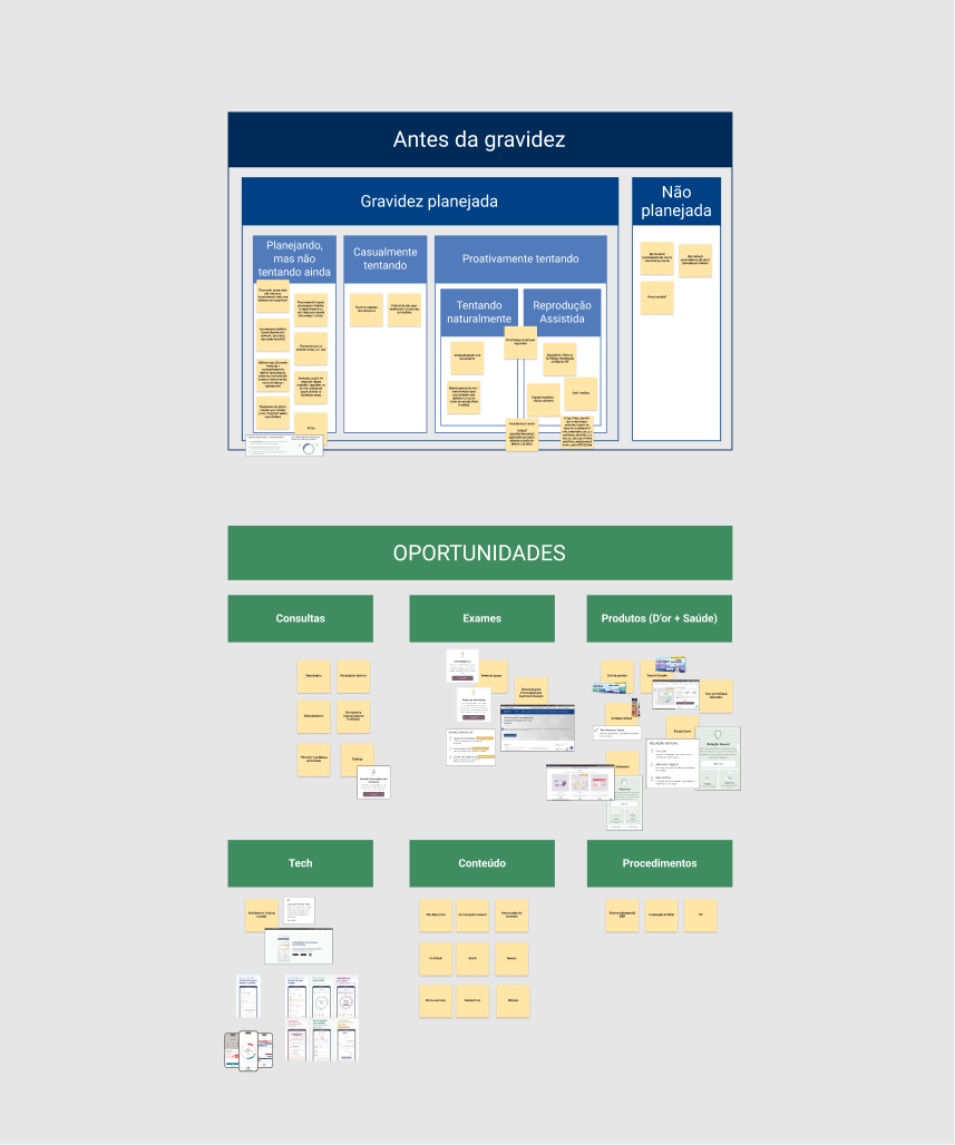
Gaining insights from various leading entities in the maternity field, I highlighted compelling reasons to avoid the cliché pink stereotype. During my presentation, I emphasized the importance of delving into color exploration, aiming to study new possibilities and reimagine the role of pink: whether it should retain its status as a primary color, transition to a secondary accent, or be removed entirely.
At the conclusion of my proposal, I provided two options for color palettes, offering stakeholders the opportunity to make the final decision. I presented a more pastel, safer choice (Option 1) alongside a more daring alternative (Option 2). Both directions incorporate a vanilla shade as our neutral in order to bring warmth, departing from Rede D'Or's light gray from their design system.
I mocked up the color palette within the proposed layout, consolidating all the points I had previously raised. This approach allowed stakeholders to grasp how everything integrated, streamlining the approval and iteration process.
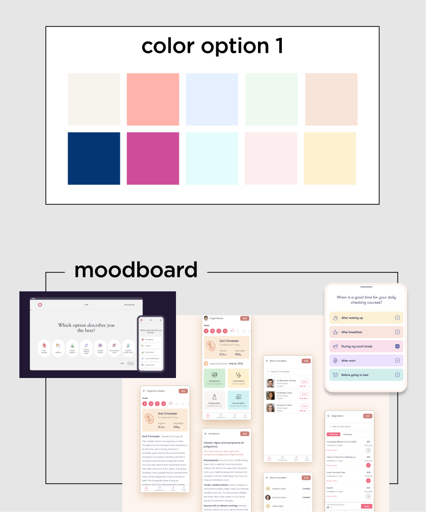
This palette maintains the essence of the brand's core colors, introducing a range of pastel shades beyond the typical baby pink. With a vibrant hot pink serving as the accent, this palette strikes a balance, retaining a touch of whimsy without veering into overly feminine or baby-centric territory.
Palette that utilizes the blue of the Rede D'Or brand and pink as an accent, but incorporates additional pastel tones as secondary colors.
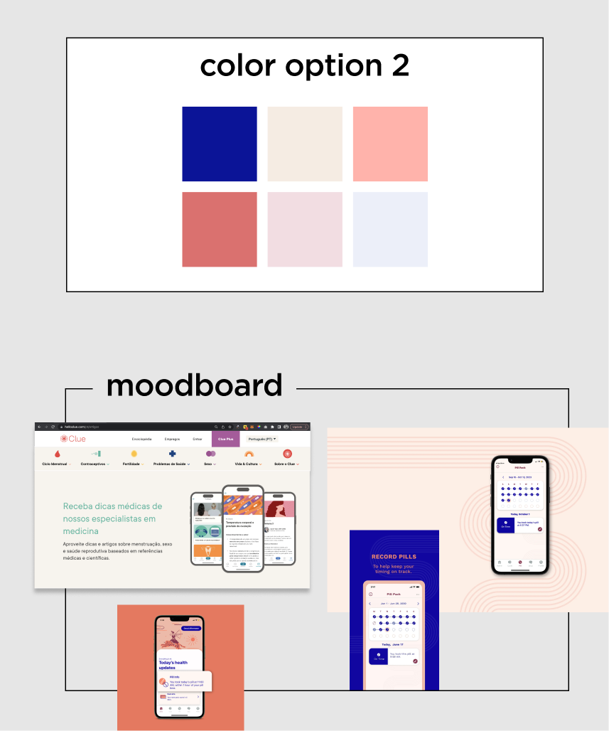
Departing from softer tones, this direction embraces a bold combination of saturated dark blue, complemented by peach and terracotta. Designed to be more mature and sophisticated, this palette is tailored to resonate with women. Additionally, it includes more hues from the same family as secondary colors.
Palette that incorporates a vibrant shade of blue and retains the peach color associated with maternity, with the addition of a terracota tone.
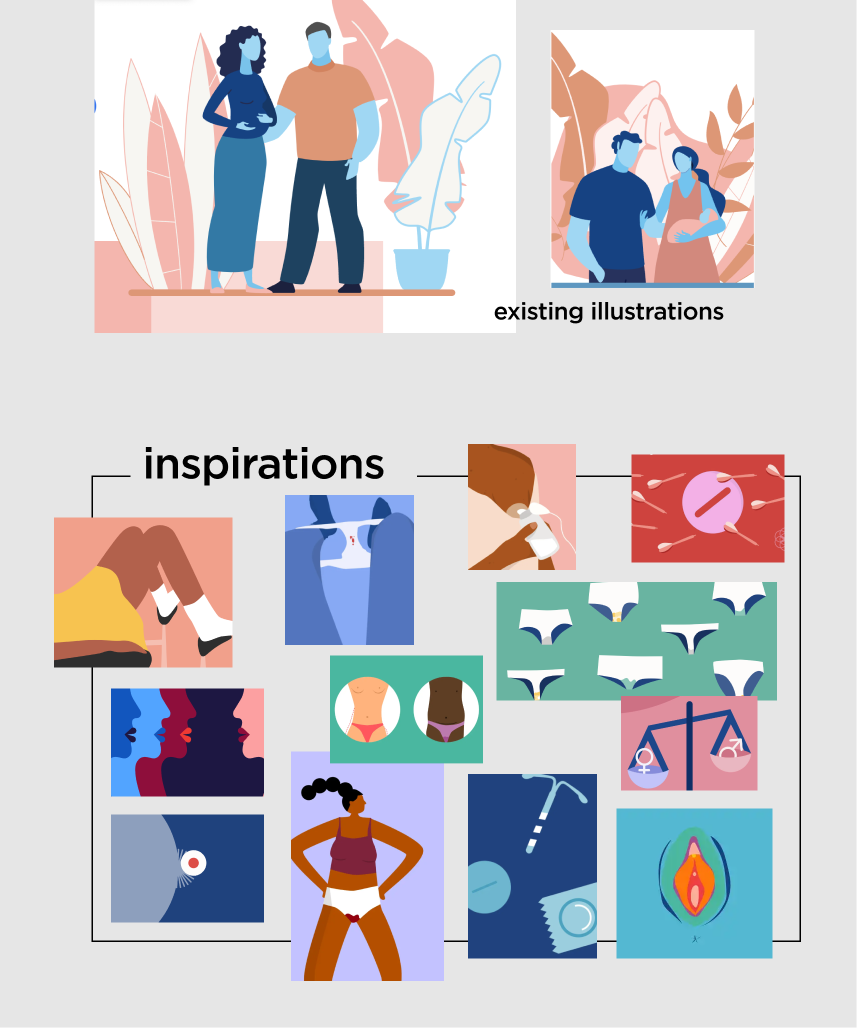
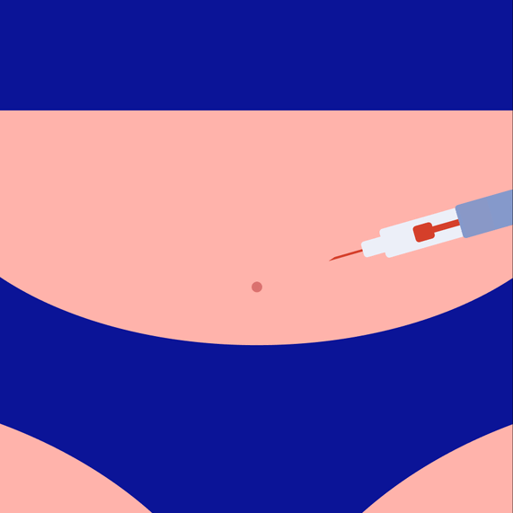
I proposed a revamped approach to illustrations, aligning with the key points previously discussed. The company already approached diversity by having all characters with a blue skin color, but I wanted to take to the next level. I advocated for diversity in race, gender, and body types, and I also proposed a more minimalist aesthetic.
Recognizing our target user as a mature woman, I emphasized the need for a more suggestive, implied, and conceptual style rather than overly literal depictions. This minimalist yet impactful direction aimed to convey messages clearly and simply, employing a limited color palette and purposeful use of negative space.
The benefits of this approach include:
. Bringing a sense of lightness to sensitive or taboo topics (such as menstruation, breastfeeding, or sex) or more serious themes (like depression or abortion).
. By streamlining elements to the essential minimum, we enable users to focus on what truly matters.
. Establishing a strong and unique look & feel.
I curated a repository of illustrations covering various themes under the umbrella of motherhood, ranging from IVF to breastfeeding. Additionally, I introduced two vibrant pop colors exclusively for use in illustrations, aimed at breaking monotony and highlighting key aspects of the compositions.
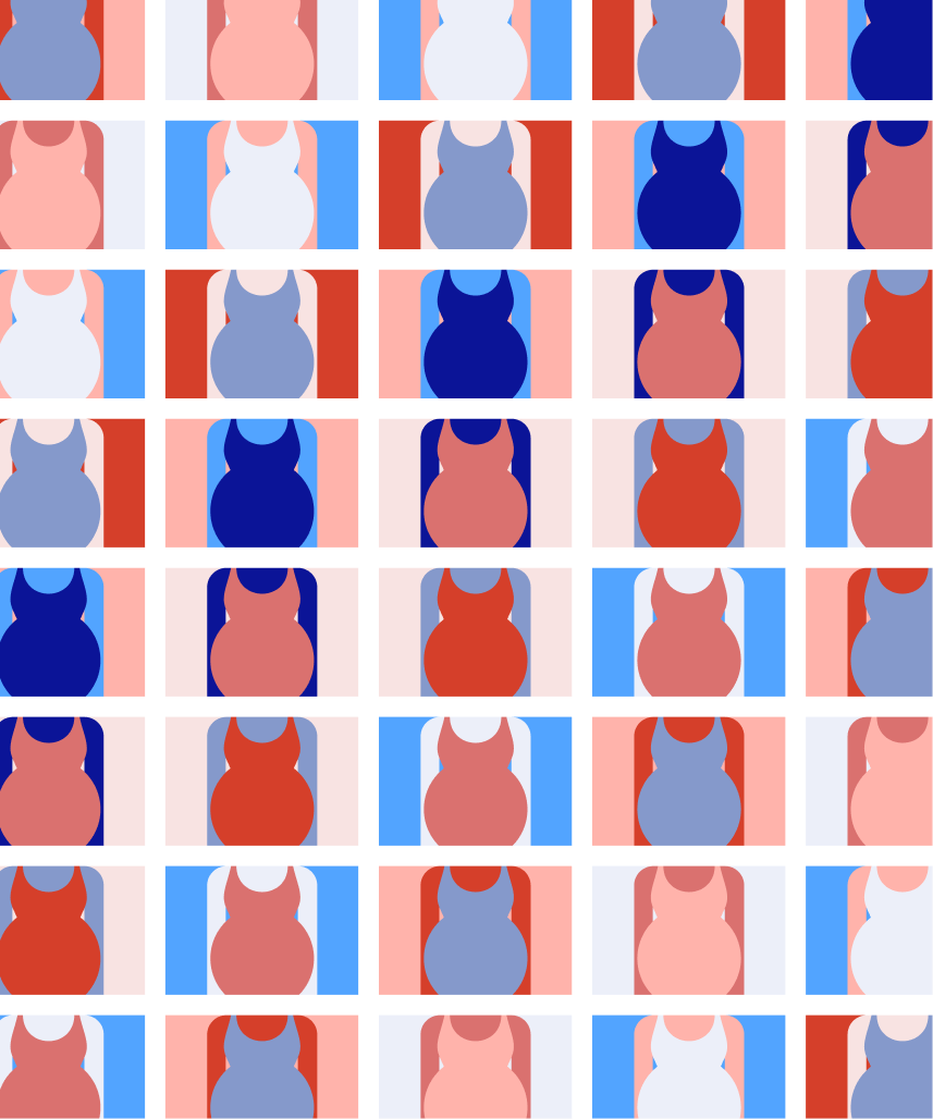
Emphasizing the celebration of diversity, I highlighted the importance of portraying a wide range of ethnicities and cultures, reflecting the real-world demographics of Brazil. With approximately 45 percent of Brazilians identifying as Pardo Brazilians, it was crucial to ensure representation that mirrored this diversity among both patients and staff.
To achieve this, I advocated for an inclusive approach in selecting skin tones for the illustrated characters. The expanded range of colors offered myriad possibilities for representing a diverse array of skin tones, as demonstrated in the examples I presented. This embodies the spectrum of diversity and inclusion and underscores a commitment to representing everyone, regardless of skin color, ethnic background, or cultural identity, thereby capturing the beauty and uniqueness of all individuals who are part of their journey.
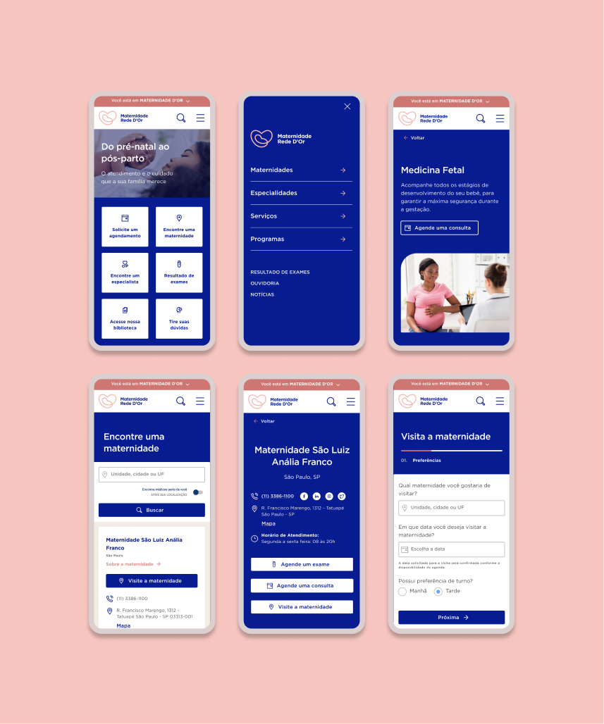
Following approval of the pitch, development began on the remaining pages, incorporating feedback and finalizing the design elements and functionalities. All new components that I created had to take into account the broader product ecosystem within Rede D'Or, so every bit went through the approval of Rede D'Or Design System designer. With the team actively engaged and providing valuable input, I received requests for adjustments to the layout, along with approval to move forward with Color Option 2 and the proposed new illustration direction.
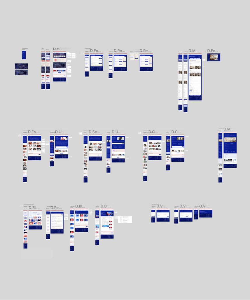
Subsequently, I initiated the creation of a UI style guide and component library, and began designing both mobile and desktop pages for the portal. Throughout this process, I continuously iterated based on their feedback, ensuring alignment with their evolving preferences and requirements.
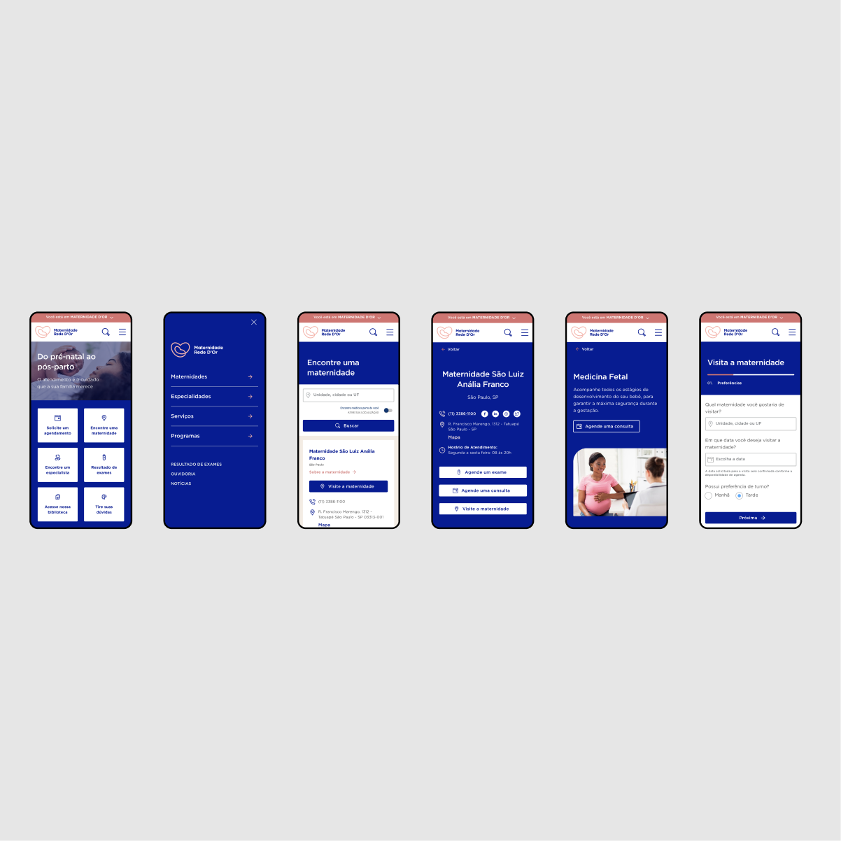
You can visit the portal by clicking here (the link opens in new tab). After the handoff, I conducted several quality assurance checks to ensure the live version matched the Figma files.
However, after launch, a stakeholder not involved in the initial approval questioned the heavy use of dark blue. This led to preference and usability tests to decide whether to shift the layout to feature light blue as the main color, with the dark blue only used as the accent.
The test results were split almost evenly, showing nearly identical conversion rates for both color schemes. I presented these findings to the stakeholders, who are still deliberating whether the color change warrants the development effort.
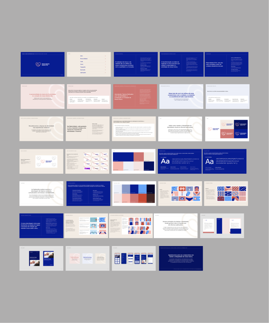
The final deliverable consisted of a comprehensive set of guidelines designed to serve as a reference for the marketing and business teams. This manual marks a significant milestone in the ongoing evolution and enhancement of the brand over the years.
The guidelines covered the following areas:
Brand: This section provided detailed instructions on the correct usage of the logo and color palette, as well as guidelines for maintaining a consistent tone of voice that reflects the brand's personality and compassion. It also included examples demonstrating how these elements come together in various applications such as print, social media, and web.
Website: This part documented the thorough review, redesign, and modernization of their maternity portal. It outlined all the changes made to create a more engaging, informative, and accessible experience for mothers.
Illustrations: I provided detailed instructions on how to achieve the desired illustration direction, including guidance on sourcing stock vector files and making adjustments to achieve the desired look. Similar documentation was provided for patterns.